Menu Close

Component design

I was heavily involved in component design, component templates, design libraries (Figma and Photoshop), and the design system at AT&T. I helped update the design system in partnership with design standards and engineering, and led the redesign of ATT.com in the new framework. I partnered in the creation of templates and design libraries, led the charge for component updates and bug fixes, and automated image creation and naming.

Here are a few of the components I worked on.

Multiple card carousel

This modular, responsive component can display two or more cards in a row, and turns into a carousel for 5+ cards on desktop and 2+ cards on mobile. It can display price and bulleted copy. It's often used to compare device prices and features, and for SEO content.

I concepted and designed this component myself as a simple means of comparing  devices.

Multi tile - laptop and phone
Mulit tile examples

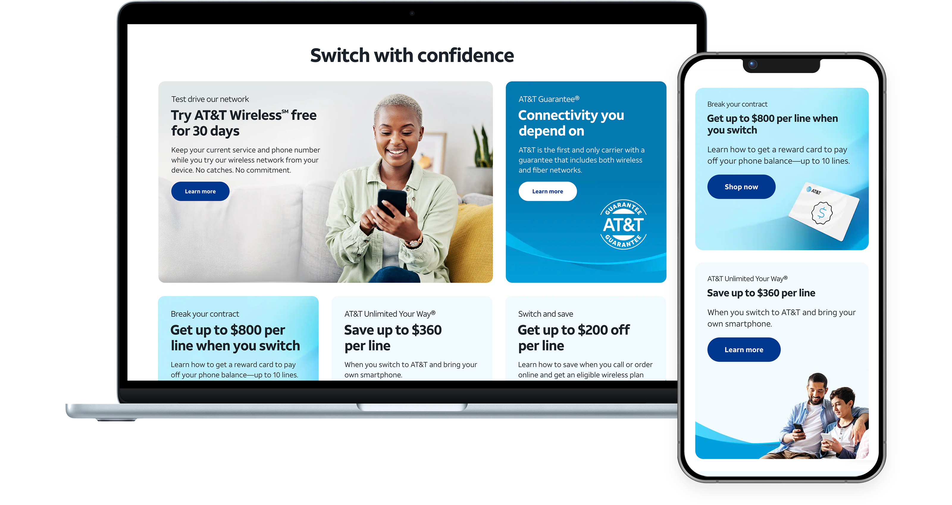
Flexible width card

This modular card has configurable width and can flex to span 1, 2, or 3 columns on the grid. It lives inside a panel and can stack onto multiple rows on desktop. Copy can left or center align, and the eyebrow supports SVG logos. The card supports background images, and foreground images that float under copy and auto-expand card height based on content height.

Flex card - laptop and phone
Flex card examples

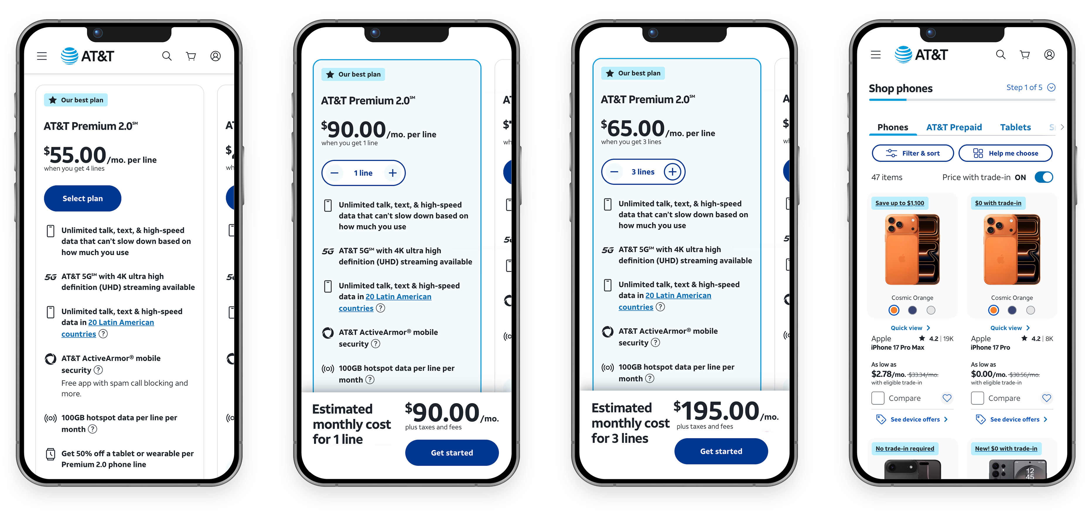
Plans configurator

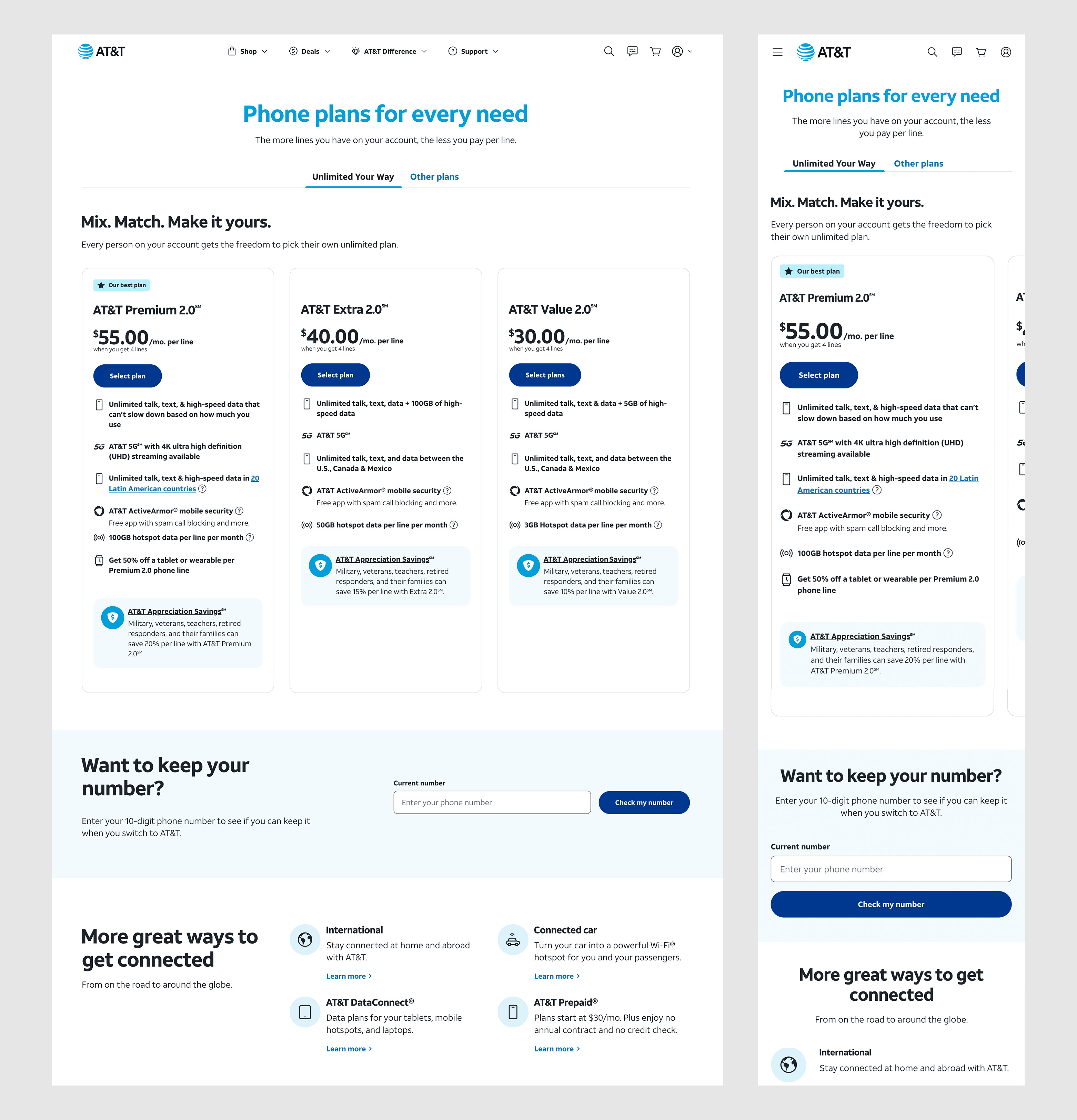
The plans configurator is a responsive component that's used to compare and select wireless plans. It can display price and plan features, and allows the user to select a plan and configure the number of lines. It resolves to the PLP where the user can select a phone for purchase.

Plan configurator - laptop and phone
Plan configurator - mobile flow
Plans wireless page
Next Project
AT&T
Explore More
AT&T